
Resources : no2 'Custom brush tutorials'
Anyone wanting to start making their own brushes should check out the nicely illustrated tutorial series.
http://www.3dtotal.com/team/tutorials/2d_custombrushes/2d_custombrushes.asp
http://www.3dtotal.com/team/tutorials/2d_custombrushes2/2d_custombrushes2.asp
http://www.3dtotal.com/team/tutorials/2d_custombrushes3/2d_custombrushes3_1.asp

Tuesday, 9 October 2007
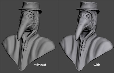
Here is a update of my plague doctor, as you can see I'm quite underway with the texture. Should be able to finish it before the deadline of 17th. Only problem is I also need to do the rest of the body before then, so I've failed!! Oh well at least I will have a great addition to my portfolio. I will also be able to use aspects of this project for some more 'education' blog entries some time in the near furture.
As always you can check progress at,

Tuesday, 2 October 2007
inspiration : no1 'Bram Eulaers'
New section then. From now on when I come across inspiring texture artists work I'll try and post them here. Enjoy.
More can be seen at http://cmdstud.khlim.be/~beulaers/portfolio/

Sunday, 30 September 2007
The images below are the property and copyright of both Triumph Studios and Codemasters

Layer 1 - Colour Base
I used Painter for the first time during Overlord. The blend tools are more organic and natural then those of Photoshops which works well for the almost 'cartoony' textures required for this game and other games such as World of Warcraft etc. This layer is JUST colours. This is the initial design stage of the texture.


Layer 2 - First photo overlay.
Added moss photo overlays to th


Tuesday, 25 September 2007
Education : no16 'AO / Lightmap'
1. Throw in skylight, plop.
2. Press '9', turn on light tracer.
3. Select Low poly and press zero key for the render to texture dialogue
4. 'Pick' High poly object
5. Make sure your low and high poly 'fit' each other well. If not then enable projection cage, reset and scrub the 'push' so that you push the cage slightly past the low poly.
6. 'Add' lighting map, setup your filename and location etc
7. Hit render
You will get a map similar to the one below. Blend it into your texture psd. (see what blend mode works best for you)
Its vital to do this with all texture passes nowadays, if not your stuff will look dated. Unless you spend ages painting all this detail in, correctly.


Wednesday, 19 September 2007
Here are some images from popular games of the past. It's interesting how people instantly know the answers from such little detail. I put this in a forum and within the night they had all the correct answers so it isn't impossible. What really blew my

Monday, 17 September 2007

Sunday, 16 September 2007
Education : no 14 'Extra detail in spec maps'
1) Don't just turn the diffuse into a spec map and be done with it. In many cases adding an extra spec grunge/dirt map like this within your spec map only can really create much more interesting and realistic textures.
2) On the left is a simple diffuse to spec conversion but even with the edges, add 'unique to spec only' brightness to it as seen on the right.

Friday, 14 September 2007
Random : no 3 'CGTalk UGAC switch/reversal Competition'
I'm currently having a stab at this challenge. Have to take an exsisting character/setting and change the style/setting/sex etc
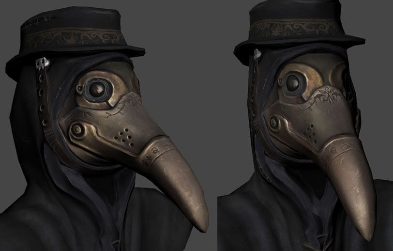
I'm going with a modern day take on the 'plague doctor' figure from the 17th century.
I've been going over the design for quite some time and finally came to this design,

You can see how I got to this design and check out any progress by going to the following link,
http://forums.cgsociety.org/showthread.php?f=39&t=537843
I'm currently having a stab at this challenge. Have to take an exsisting character/setting and change the style/setting/sex etc
I'm going with a modern day take on the 'plague doctor' figure from the 17th century.
I've been going over the design for quite some time and finally came to this design,
You can see how I got to this design and check out any progress by going to the following link,
http://forums.cgsociety.org/showthread.php?f=39&t=537843
Tuesday, 11 September 2007

Flashback : no2 'Gears of War texture part 4'
Final part then. Check it area number 4. Again that scratched away surface could be more defined but I won't bring up texture definition again. No the problem I have with this is how its just on ONE of multiple ridges. It all goes back to education no3 where I mentioned storytelling in texture work. If you think about it what I did in this texture meant that when this trunk was being moved about only that particular ridge was getting hit against surfaces. Which of course is just stupid beyond words. The truth is those ridges will be generally getting hit almost equally with there being slightly more damage to the ridges nearer to the corners. Anyway for my fix I only spent a minute but it still shows how if I were to do this again I would tone down the rubbed off/scratched/effected areas on the ridge and apply the same kind of detail to all ridges.


Sunday, 9 September 2007
Career : no1 'Introduction'
Today marks the anniversary of my second year working for my current (and first) games studio. So it seems fitting to start this new topic today. I remember when researching how to land a job in the games industry and on reflection I made quite a few mistakes that I'll share to those who are currently or about to look for their first job. It's not meant to be a 'This is how you get a job!!' series of articles (I'm crap at it anyway, took me 30+ attempts to succeed) , its just what I experienced and how I approached it.So for now just a lighthearted reference to quite possibly one of the more influential pieces of advise I received at University which oddly enough came from a Pixar seminar held by Mark Walsh and Rob Russ. During the Q+A one student asked how they can get a job at Pixar. They replied for quite some time about the great lengths you have to go to land the job, how you have to be mega super amazing, how you have to know this and that and how you HAVE to do this and that as well as this. Then at the end they say '...or, you could find the next Pixar'. That was one of the reasons why I looked into and considered the outsourcing industry. I saw it as a upcoming area since at the time we were approaching the Next Gen era where I knew most developers would eventually have to use outsourcing for the big budget games.
Of course I did apply to all the obvious studios as well as the smaller ones but thankfully I also looked into the idea of something more, different. It was quite a risk but its payed off, I can't think of a better place to gain experience. Where else in under 2 years could you be working on your NINTH title?
Today marks the anniversary of my second year working for my current (and first) games studio. So it seems fitting to start this new topic today. I remember when researching how to land a job in the games industry and on reflection I made quite a few mistakes that I'll share to those who are currently or about to look for their first job. It's not meant to be a 'This is how you get a job!!' series of articles (I'm crap at it anyway, took me 30+ attempts to succeed) , its just what I experienced and how I approached it.
Of course I did apply to all the obvious studios as well as the smaller ones but thankfully I also looked into the idea of something more, different. It was quite a risk but its payed off, I can't think of a better place to gain experience. Where else in under 2 years could you be working on your NINTH title?

Thursday, 6 September 2007

Wednesday, 5 September 2007
Random : no2 'Wacom tablet'
Starting using Wacom tablets in 2003. From a texture artist point of view its good practice to use your pen for work outside of texturing from time to time. Here is my official first stab at painting with a tablet pen. I think its ticking all the wrong boxes here including design, perspective, colour scheme, lighting, defining areas etc. Then below is my latest example of wacom skills which was for a personal project.


Starting using Wacom tablets in 2003. From a texture artist point of view its good practice to use your pen for work outside of texturing from time to time. Here is my official first stab at painting with a tablet pen. I think its ticking all the wrong boxes here including design, perspective, colour scheme, lighting, defining areas etc. Then below is my latest example of wacom skills which was for a personal project.
Monday, 3 September 2007
Flashback : no3 "Overlord"
The images below are the property and copyright of both Triumph Studios and Codemasters
Two textures created for Overlord meshes (mesh created by another Streamline Artist)
Quite possibly my favourite project to work on so far. It wasn't that technical, had a simple engine and it was all about painting skills. The textures were usually about 60-70% handpainted and only 30-40% photo work.
Thursday, 30 August 2007
Flashback : no2 'Gears of War texture Part 1'
The images below are the property and copyright of Epic.
Here is the first texture I made for this project. Looking back at it I believe it works well overall but when you actually look at the texture sheet it really comes across as quite amateur, i've certainly improved alot since then.

OK so for this part we're looking at area 1. I made this area look nice and worn but in a very general approach. This mainly consisted of splashing some colour around and sticking some very soft photo overlays. However what I'd do if I were to do this again would be to go in there and draw in extra details by using the photo overlay as a template. By brushing in edge highlights and inner shadows for the worn areas you can really help to pop out the details. Quick example below. 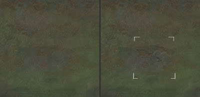
The images below are the property and copyright of Epic.


Monday, 27 August 2007
Education : no13 'quick colour pass'
In just about every texture I do I try to make a layer with insanely low opacity strokes of random colours which I overlay very softly over the texture. I find it gives everything a bit more life. Even in this example its a bit too much but I needed to do so just to get the point across.
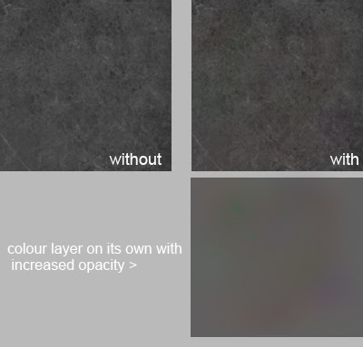
In just about every texture I do I try to make a layer with insanely low opacity strokes of random colours which I overlay very softly over the texture. I find it gives everything a bit more life. Even in this example its a bit too much but I needed to do so just to get the point across.

Friday, 24 August 2007
Education : No12 'Redefining Cartoony game art'
Here is an short article written by a good friend of mine that I had the pleasure of meeting during my university days. The article explores the many different types of cartoon texturing in the gaming scene.
http://www.gamasutra.com/features/20060417/sondergaard_01.shtml
Here is an short article written by a good friend of mine that I had the pleasure of meeting during my university days. The article explores the many different types of cartoon texturing in the gaming scene.
http://www.gamasutra.com/features/20060417/sondergaard_01.shtml

Thursday, 23 August 2007
Education : no11 'Base building from photos'
I sometimes like to make texture bases which I store and keep. It involves taking a cool feature from a problematic photo and generally repeating it everywhere to give you a layer that you can easily adjust and overlay your textures. In the example it is finally overlayed a flat gray with exclusion at 65%, this is just so you can easily see it but in this case I'd drop it down to something like 15-30% as its a very busy texture.
I sometimes like to make texture bases which I store and keep. It involves taking a cool feature from a problematic photo and generally repeating it everywhere to give you a layer that you can easily adjust and overlay your textures. In the example it is finally overlayed a flat gray with exclusion at 65%, this is just so you can easily see it but in this case I'd drop it down to something like 15-30% as its a very busy texture.

Wednesday, 22 August 2007
Resources : no1
Nice sites for interesting environmental reference,
http://home.f01.itscom.net/spiral/research3.html
http://www.boreally.org/fr/bonus.php
Good alternative to google image search
http://www.flickr.com
Nice sites for interesting environmental reference,
http://home.f01.itscom.net/spiral/research3.html
http://www.boreally.org/fr/bonus.php
Good alternative to google image search
http://www.flickr.com
Tuesday, 21 August 2007
Education : no10 'Shadow/Highlight Adjustment tool'
Sometimes texture photo sources have light coming from one direction (image on left). One method to balance out the light source is to use image>adjustment>shadow/highlights (as seen in the image on the right). Then you can adjust levels/saturation etc to bring back the original colour. Not always a perfect solution (the perfect solution involves messing around with the gradient tool) but one which can produce good methods in under a minute.
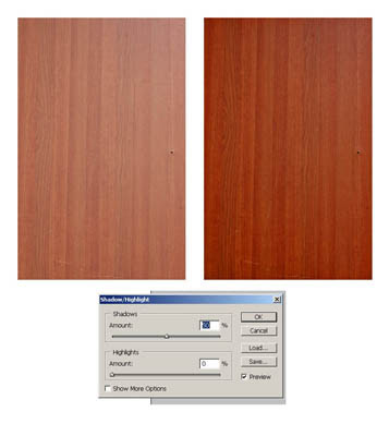
Sometimes texture photo sources have light coming from one direction (image on left). One method to balance out the light source is to use image>adjustment>shadow/highlights (as seen in the image on the right). Then you can adjust levels/saturation etc to bring back the original colour. Not always a perfect solution (the perfect solution involves messing around with the gradient tool) but one which can produce good methods in under a minute.

Monday, 20 August 2007
Education : no9 'creating edgework in under a minute'
This handy trick from 'mr kite' on cgchat shows how to create simple edges. It involves making a 'cavity' layer that you eventually set to 'soft light' blending mode over your diffuse. It creates simple clean edgework everywhere based on your normal map. Obviously you should n't leave your edgework like this in most cases it will look too clean but it's a great place to start.


Additionally, you may want to clean it up by picking out the dark colours and using the replace colour tool to make them 50% grey like most of the map. Remember, you only want the highlight info here.
This handy trick from 'mr kite' on cgchat shows how to create simple edges. It involves making a 'cavity' layer that you eventually set to 'soft light' blending m
Thursday, 16 August 2007
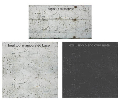
Education : no8 'Patch Tool'
Patch tool. It's in the same button menu as the heal tool (shown in previous blog). Print screen or copy image and load the image below into Photoshop. Make a selection box around the 'messy' part of the line. Go to patch tool and drag inside the box. Using this tool you can fix the line so it is perfectly clean. It can be useful in many situations, it can sometimes be really helpful when cleaning up normal maps.

Patch tool. It's in the same button menu as the heal tool (shown in previous blog). Print screen or copy image and load the image below into Photoshop. Make a selection box around the 'messy' part of the line. Go to patch tool and drag inside the box. Using this tool you can fix the line so it is perfectly clean. It can be useful in many situations, it can sometimes b
Tuesday, 14 August 2007
Education : no7 'Heal tool'
Never even used about this brush until I got into the industry which is odd since it plays such a big part in my texturing process these days.

Hold down on this button to reveal other options, select 'healing brush tool'. Anyway here is an example of its powers. Below I have used the clone stamp to add some of the left texture to the right. Then in the next example I use the healing tool, notice how it calculates the colours it needs to shift to to blend into the new image?


Never even used about this brush until I got into the industry which is odd since it plays such a big part in my texturing process these days.
Hold down on this button to reveal other options, select 'healing brush tool'. Anyway here is an example of its powers. Below I have use
Sunday, 12 August 2007
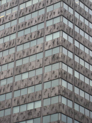
Random no1 : 'Real world texture design'
This is one building I pass everyday on my way to work. It's become quite an icon to those at my work who also pass it. It is known as the 'badly textured building' or the 'building with obvious mirroring'.
I remember having to texture a shop interior in Saints Row, due to texture and time budgets we were forced to repeat 3 poster designs to fill the 6 poster meshes in the shop. At the time I was thinking the idea that they would have 2 of the exact same posters in the same shop would be unrealistic not to mention boring. Here however are e xamples showing it really does happen and whats more is that they are even placed right next to each other, just in case anyone misses the one on the left.
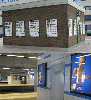
Then there is this wall design in our train station. The pattern is very random. For example it is odd how the blue line doesn't just carry on till the edge. Also the random widths in between the red lines.
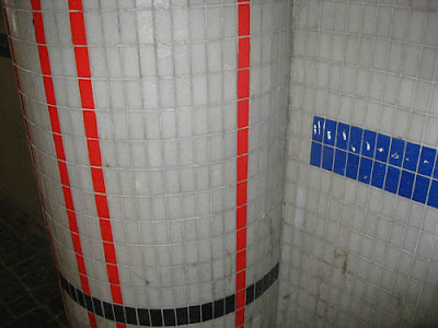
I find it interesting how all game worlds are made by artistic people yet the real world does have areas designed and put together by people with no eye for design at all. I'm sure if I created any of the above I would get criticisms such as 'Obvious mirroring, too repetitive, inconsistent design etc'. Even really torn up dumps in games are beautifully designed. If you have a bag of chips/crisps spilling onto the floor you can be sure their layout and composition has been thought out.
This is one building I pass everyday on my way to work. It's become quite an icon to those at my work who also pass it. It is known as the 'badly textured building' or the 'building with obvious mirroring'.

I remember having to texture a shop interior in Saints Row, due to texture and time budgets we were forced to repeat 3 poster designs to fill the 6 poster meshes in the shop

Then there is this wall design in our train station. The pattern is very random. For example it is odd how the blue line doesn't just carry on till the edge. Also the random widths in between the red lines.

I find it interesting how all game worlds are made by artistic people yet the real world does have areas designed and put together by people with no eye for design at all. I'm sure if I created any of the above I would get criticisms such as 'Obvious mirroring, too repetitive, inconsistent design etc'. Even really torn up dumps in game
Thursday, 9 August 2007
Tuesday, 7 August 2007
Education : no5 'Starting a project'
Whenever I start a new project I usually spend 1-3 hours checking out reference and building a reference library. If one is supplied I pick out what those that I consider important and then continue to search for extra reference. From this I usually create my very own desktop wallpaper that has all key reference slapped on which I find quite helpful to be constantly reminded of the key aspects of the current project. The idea being that it will start sneaking into your subconscious mind while painting. Something like that.
Whenever I start a new project I usually spend 1-3 hours checking out reference and building a reference library. If one is supplied I pick out what those that I consider important and then continue to search for extra reference. From this I usually create my very own desktop wallpaper that has all key reference slapped on which I find quite helpful to be constantly reminded of the key aspects of the current project. The idea being that it will start sneaking into your subconscious mind while painting. Something like that.
Monday, 6 August 2007
Education : no4 'RGB tweaking in Normals'
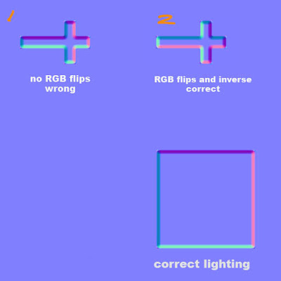
Classic normal map mistake problem here. Imagine you have normal mapped a coffin with a Crucifixion on top that had to have its uv's ROTATED to have a nice fit. Did you know this will mess with the lighting of the normals? Look at th e square with proper lighting with purple on top, pink on right, dark blue on left and light blue on bottom. However in example 1, because the uv's were rotated the purple will now be on the left side of the cross instead of the top as seen with the square. I have a set of 3 short key actions that I can play with to rotate and flip the lights, these are 'Invert Red Channel', 'Invert Green Channel' and 'Flip RG'. As you can see in 2 I have changed it so that if it were to be rotated as intended the lights would be exactly the same as the square.
'Flip RG' incase you're wondering involves bringing up the channel mixer and then going into red channel. Take red to 0 and green to 100. Then go into green channel and take green to 0 and red to 100.
Remember, Red Channel shows light horizontally and Green Channel shows light vertically. Inverting these changes the lighting in your normal map. 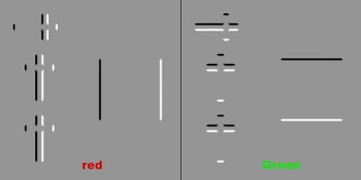

'Flip RG' incase you're wondering involves bringing up the channel mixer and then going into red channel. Take red to 0 and green to 100. Then go into green channel and take green to 0 and red to 100.

Sunday, 5 August 2007
Education : no3 'Texture storytelling'
For quite a while the idea of 'telling a story within your textures' felt a bit cliche to me. The problem initially was that I found it hard to get deeper then 'this door has a blood splatter that was caused from recent zombie carnage'.
The following is a old PDF from the famous Leigh of CGtalk that's worth reading if you haven't already. Even if its just the first half.
http://www.leighvanderbyl.com/pdf/texturing.pdf
In regards to 'storytelling' its really just about asking yourself more open ended questions. So in the case of my terrible blood stained door example I would go on to think about questions such as how tall this zombie was?, what was it doing as its head exploded?, how thick is the blood?, when did this incident happen? What made his head explode? Its all about collecting ideas to play with, the more you have the more chance you have of creating a originally interesting texture.
The following is a old PDF from the famous Leigh of CGtalk that's worth reading if you haven't already. Even if its just the first half.
http://www.leighvanderbyl.com/pdf/texturing.pdf
Friday, 3 August 2007
Flashback : no1 'My first ever texture map'
Managed to track down my first ever texture! Simply a horrible brown base with some noise (done with a filter I may add) and a photo of a rock surface, blending mode set to overlay. So boring, no focus points at all. Dull colours. How would I fix this now? Its not actually bad for a 'background' layer. I would lower the opacity by around 70-80% and start to paint on top of that. Adding subtle colour, focus points, occlusion etc.
I never even got round to using this as it was so bad.

I never even got round to using this as it was so bad.
Tuesday, 31 July 2007

Life Drawing : no1
Once a week we usually bring in a model into the studio to draw. I've always been into concept art and doodling but find realistic anatomy and proportions quite a challange. Wish I had some of my older life drawings as I'm sure I've improved over the last few months. THIS is why I created this blog!
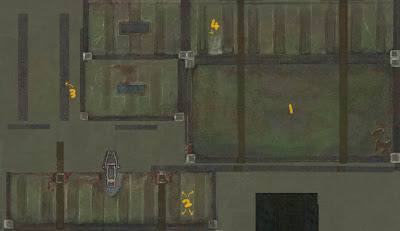
Education : no1 'Focus spots'
I once asked someone at work to explain in under 60 seconds what makes a texture good, he doodled the following within 30seconds, no words. These pictures won't turn you into a great texture artist over night but I think its a very simple visual way to explain a fundamental rule of texturing.

The first example is a stone texture. I know, it looks JUST like stone. The second example was made up by myself as a continuation of the first example. It is wood and yes again it looks JUST like wood. Lesson is that this simply isn't enough. Notice how if you look at the bad examples your eye looks at the texture map as a whole where at in the good example your eyes focus on the interesting areas one by one? (orange dots or connecting cracks depending on the example) while the boring but wonderful base texture acts as 'background'.
The first example is a stone texture. I know, it looks JUST like stone. The second example was made up by myself as a continuation of the first example. It is wood and yes again it looks JUST like wood. Lesson is that this simply isn't enough. Notice how if you look at the bad examples your eye looks at the texture map as a whole where at in the good example your eyes focus on the interesting areas one by one? (orange dots or connecting cracks depending on the example) while the boring but wonderful base texture acts as 'background'.
Monday, 30 July 2007
So who and what is caponeart? and why is there now a blog?
So, caponeart is art that can only be created myself, Adam Capone. I created art for quite some time before developing it further for around 8 years after school and finally landed my first job at Streamline Studios as a texture artist working on various videogames, where I soon discovered that infact my art skills were a bit rubbish compared to my new peers. Luckily for me my apparant dedication and potential outweighed my character mesh that had too many loops around the mouth and that hideously monotone texture on my underground subway environment.
At my current workplace we have this routine of writing up a daily report that explains what we did, encounters we had, problems we have and you're free to include comments about where the project is going. These are stored in a simple network area and are easy to navigate. During long projects it's interesting to go back and see these issues you had day by day and how it unfolded.
'Skip to the end?' Ok so the creation of this blog came about while mulling over the idea of a 'daily' report that covers my career as a whole. Now that should be an interesting read in many years to come.
During the blog I hope to talk about past, present and future in regards to my career in games, my love of art in games and educational tips on texturing, in games.
Subscribe to:
Posts (Atom)