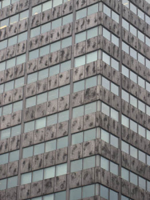
This is one building I pass everyday on my way to work. It's become quite an icon to those at my work who also pass it. It is known as the 'badly textured building' or the 'building with obvious mirroring'.

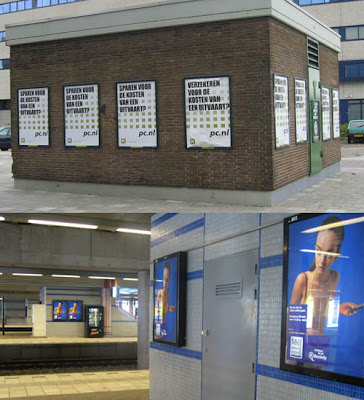
I remember having to texture a shop interior in Saints Row, due to texture and time budgets we were forced to repeat 3 poster designs to fill the 6 poster meshes in the shop

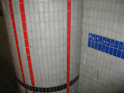
Then there is this wall design in our train station. The pattern is very random. For example it is odd how the blue line doesn't just carry on till the edge. Also the random widths in between the red lines.

I find it interesting how all game worlds are made by artistic people yet the real world does have areas designed and put together by people with no eye for design at all. I'm sure if I created any of the above I would get criticisms such as 'Obvious mirroring, too repetitive, inconsistent design etc'. Even really torn up dumps in game


2 comments:
you are sooo right!
I find myself also looking at stuff in real life and saying to myself... If I put that into a game people would complain!
Great blog dude!! im really enjoying it. I added your hotmail account on MSN. hopefully you use msn :)
Keep up the good work.
Post a Comment