The images below are the property and copyright of Epic.
Blog Patrol
About Me
Blog Archive
-
▼
2007
(33)
-
▼
August
(15)
- Flashback : no2 'Gears of War texture Part 1'The i...
- Education : no13 'quick colour pass'In just about ...
- Education : No12 'Redefining Cartoony game art'Her...
- Education : no11 'Base building from photos'I some...
- Resources : no1 Nice sites for interesting environ...
- Education : no10 'Shadow/Highlight Adjustment tool...
- Education : no9 'creating edgework in under a minu...
- Education : no8 'Patch Tool'Patch tool. It's in th...
- Education : no7 'Heal tool'Never even used about t...
- Random no1 : 'Real world texture design'This is on...
- Education : no6 'Random Stuff 01'In Photoshop if y...
- Education : no5 'Starting a project'Whenever I sta...
- Education : no4 'RGB tweaking in Normals'Classic n...
- Education : no3 'Texture storytelling'For quite a ...
- Flashback : no1 'My first ever texture map'Managed...
-
▼
August
(15)
Thursday, 30 August 2007
Flashback : no2 'Gears of War texture Part 1'
The images below are the property and copyright of Epic.
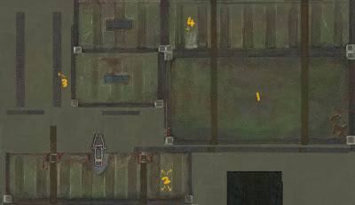
Here is the first texture I made for this project. Looking back at it I believe it works well overall but when you actually look at the texture sheet it really comes across as quite amateur, i've certainly improved alot since then.
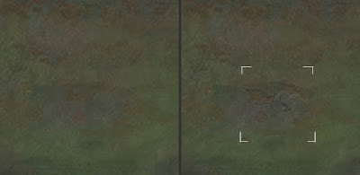
OK so for this part we're looking at area 1. I made this area look nice and worn but in a very general approach. This mainly consisted of splashing some colour around and sticking some very soft photo overlays. However what I'd do if I were to do this again would be to go in there and draw in extra details by using the photo overlay as a template. By brushing in edge highlights and inner shadows for the worn areas you can really help to pop out the details. Quick example below.
The images below are the property and copyright of Epic.
Monday, 27 August 2007
Education : no13 'quick colour pass'
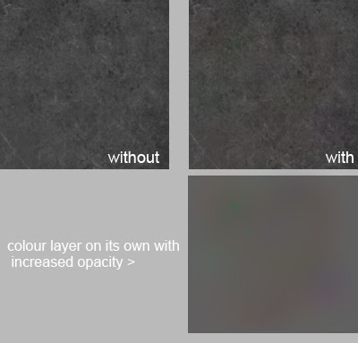
In just about every texture I do I try to make a layer with insanely low opacity strokes of random colours which I overlay very softly over the texture. I find it gives everything a bit more life. Even in this example its a bit too much but I needed to do so just to get the point across.
Friday, 24 August 2007
Education : No12 'Redefining Cartoony game art'
Here is an short article written by a good friend of mine that I had the pleasure of meeting during my university days. The article explores the many different types of cartoon texturing in the gaming scene.
http://www.gamasutra.com/features/20060417/sondergaard_01.shtml
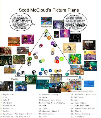
Here is an short article written by a good friend of mine that I had the pleasure of meeting during my university days. The article explores the many different types of cartoon texturing in the gaming scene.
http://www.gamasutra.com/features/20060417/sondergaard_01.shtml
Thursday, 23 August 2007
Education : no11 'Base building from photos'
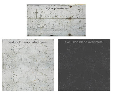
I sometimes like to make texture bases which I store and keep. It involves taking a cool feature from a problematic photo and generally repeating it everywhere to give you a layer that you can easily adjust and overlay your textures. In the example it is finally overlayed a flat gray with exclusion at 65%, this is just so you can easily see it but in this case I'd drop it down to something like 15-30% as its a very busy texture.
Wednesday, 22 August 2007
Resources : no1
Nice sites for interesting environmental reference,
http://home.f01.itscom.net/spiral/research3.html
http://www.boreally.org/fr/bonus.php
Good alternative to google image search
http://www.flickr.com
Nice sites for interesting environmental reference,
http://home.f01.itscom.net/spiral/research3.html
http://www.boreally.org/fr/bonus.php
Good alternative to google image search
http://www.flickr.com
Tuesday, 21 August 2007
Education : no10 'Shadow/Highlight Adjustment tool'
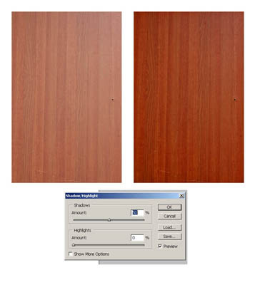
Sometimes texture photo sources have light coming from one direction (image on left). One method to balance out the light source is to use image>adjustment>shadow/highlights (as seen in the image on the right). Then you can adjust levels/saturation etc to bring back the original colour. Not always a perfect solution (the perfect solution involves messing around with the gradient tool) but one which can produce good methods in under a minute.
Monday, 20 August 2007
Education : no9 'creating edgework in under a minute'
This handy trick from 'mr kite' on cgchat shows how to create simple edges. It involves making a 'cavity' layer that you eventually set to 'soft light' blending mode over your diffuse. It creates simple clean edgework everywhere based on your normal map. Obviously you should n't leave your edgework like this in most cases it will look too clean but it's a great place to start.
Additionally, you may want to clean it up by picking out the dark colours and using the replace colour tool to make them 50% grey like most of the map. Remember, you only want the highlight info here.
This handy trick from 'mr kite' on cgchat shows how to create simple edges. It involves making a 'cavity' layer that you eventually set to 'soft light' blending m
Thursday, 16 August 2007
Education : no8 'Patch Tool'
Patch tool. It's in the same button menu as the heal tool (shown in previous blog). Print screen or copy image and load the image below into Photoshop. Make a selection box around the 'messy' part of the line. Go to patch tool and drag inside the box. Using this tool you can fix the line so it is perfectly clean. It can be useful in many situations, it can sometimes be really helpful when cleaning up normal maps.
Patch tool. It's in the same button menu as the heal tool (shown in previous blog). Print screen or copy image and load the image below into Photoshop. Make a selection box around the 'messy' part of the line. Go to patch tool and drag inside the box. Using this tool you can fix the line so it is perfectly clean. It can be useful in many situations, it can sometimes b
Tuesday, 14 August 2007
Education : no7 'Heal tool'
Never even used about this brush until I got into the industry which is odd since it plays such a big part in my texturing process these days.
Hold down on this button to reveal other options, select 'healing brush tool'. Anyway here is an example of its powers. Below I have used the clone stamp to add some of the left texture to the right. Then in the next example I use the healing tool, notice how it calculates the colours it needs to shift to to blend into the new image?
Never even used about this brush until I got into the industry which is odd since it plays such a big part in my texturing process these days.
Hold down on this button to reveal other options, select 'healing brush tool'. Anyway here is an example of its powers. Below I have use
Sunday, 12 August 2007
Random no1 : 'Real world texture design'
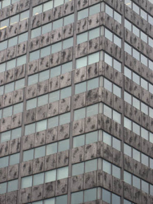
This is one building I pass everyday on my way to work. It's become quite an icon to those at my work who also pass it. It is known as the 'badly textured building' or the 'building with obvious mirroring'.
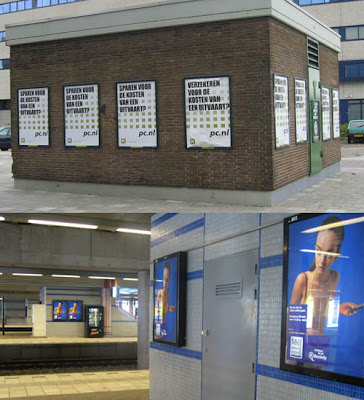
I remember having to texture a shop interior in Saints Row, due to texture and time budgets we were forced to repeat 3 poster designs to fill the 6 poster meshes in the shop. At the time I was thinking the idea that they would have 2 of the exact same posters in the same shop would be unrealistic not to mention boring. Here however are e xamples showing it really does happen and whats more is that they are even placed right next to each other, just in case anyone misses the one on the left.
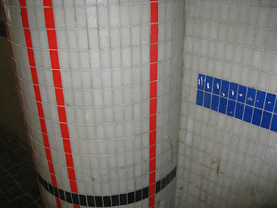
Then there is this wall design in our train station. The pattern is very random. For example it is odd how the blue line doesn't just carry on till the edge. Also the random widths in between the red lines.
I find it interesting how all game worlds are made by artistic people yet the real world does have areas designed and put together by people with no eye for design at all. I'm sure if I created any of the above I would get criticisms such as 'Obvious mirroring, too repetitive, inconsistent design etc'. Even really torn up dumps in games are beautifully designed. If you have a bag of chips/crisps spilling onto the floor you can be sure their layout and composition has been thought out.
This is one building I pass everyday on my way to work. It's become quite an icon to those at my work who also pass it. It is known as the 'badly textured building' or the 'building with obvious mirroring'.
I remember having to texture a shop interior in Saints Row, due to texture and time budgets we were forced to repeat 3 poster designs to fill the 6 poster meshes in the shop
Then there is this wall design in our train station. The pattern is very random. For example it is odd how the blue line doesn't just carry on till the edge. Also the random widths in between the red lines.
I find it interesting how all game worlds are made by artistic people yet the real world does have areas designed and put together by people with no eye for design at all. I'm sure if I created any of the above I would get criticisms such as 'Obvious mirroring, too repetitive, inconsistent design etc'. Even really torn up dumps in game
Thursday, 9 August 2007
Education : no6 'Random Stuff 01'
In Photoshop if you're making a tileable texture and have a layer with detail outside your canvas it will show when offsetting it. Easiest solution? Ctrl+A and then image>crop
Tuesday, 7 August 2007
Education : no5 'Starting a project'
Whenever I start a new project I usually spend 1-3 hours checking out reference and building a reference library. If one is supplied I pick out what those that I consider important and then continue to search for extra reference. From this I usually create my very own desktop wallpaper that has all key reference slapped on which I find quite helpful to be constantly reminded of the key aspects of the current project. The idea being that it will start sneaking into your subconscious mind while painting. Something like that.
Monday, 6 August 2007
Education : no4 'RGB tweaking in Normals'
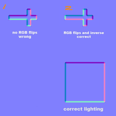
Classic normal map mistake problem here. Imagine you have normal mapped a coffin with a Crucifixion on top that had to have its uv's ROTATED to have a nice fit. Did you know this will mess with the lighting of the normals? Look at th e square with proper lighting with purple on top, pink on right, dark blue on left and light blue on bottom. However in example 1, because the uv's were rotated the purple will now be on the left side of the cross instead of the top as seen with the square. I have a set of 3 short key actions that I can play with to rotate and flip the lights, these are 'Invert Red Channel', 'Invert Green Channel' and 'Flip RG'. As you can see in 2 I have changed it so that if it were to be rotated as intended the lights would be exactly the same as the square.
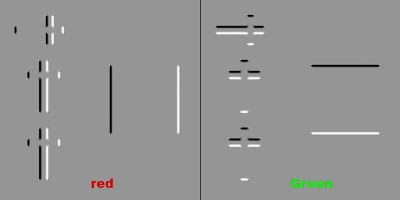
'Flip RG' incase you're wondering involves bringing up the channel mixer and then going into red channel. Take red to 0 and green to 100. Then go into green channel and take green to 0 and red to 100.
Remember, Red Channel shows light horizontally and Green Channel shows light vertically. Inverting these changes the lighting in your normal map.
'Flip RG' incase you're wondering involves bringing up the channel mixer and then going into red channel. Take red to 0 and green to 100. Then go into green channel and take green to 0 and red to 100.
Sunday, 5 August 2007
Education : no3 'Texture storytelling'
For quite a while the idea of 'telling a story within your textures' felt a bit cliche to me. The problem initially was that I found it hard to get deeper then 'this door has a blood splatter that was caused from recent zombie carnage'.
The following is a old PDF from the famous Leigh of CGtalk that's worth reading if you haven't already. Even if its just the first half.
http://www.leighvanderbyl.com/pdf/texturing.pdf
In regards to 'storytelling' its really just about asking yourself more open ended questions. So in the case of my terrible blood stained door example I would go on to think about questions such as how tall this zombie was?, what was it doing as its head exploded?, how thick is the blood?, when did this incident happen? What made his head explode? Its all about collecting ideas to play with, the more you have the more chance you have of creating a originally interesting texture.
The following is a old PDF from the famous Leigh of CGtalk that's worth reading if you haven't already. Even if its just the first half.
http://www.leighvanderbyl.com/pdf/texturing.pdf
Friday, 3 August 2007
Flashback : no1 'My first ever texture map'
Managed to track down my first ever texture! Simply a horrible brown base with some noise (done with a filter I may add) and a photo of a rock surface, blending mode set to overlay. So boring, no focus points at all. Dull colours. How would I fix this now? Its not actually bad for a 'background' layer. I would lower the opacity by around 70-80% and start to paint on top of that. Adding subtle colour, focus points, occlusion etc.
I never even got round to using this as it was so bad.
Subscribe to:
Posts (Atom)