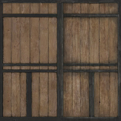
So below is an image showing wooden planks, on the left is the original texture I did and on the right I spent about 5 minutes quickly throwing in a few basic improvements just to give you an idea of what I would do if I were to do this again.
1. The dirt gather under the planks on the front was originally just intense and small. I added more by bringing out at lower opacity to give the texture more depth. Before, it just looked too flat.
2. Added an overlay using an image of water drips. This gives the texture more life and adds more tones. Before the lighter wood pieces had hardly any colour variation. This helps to break up the texture.
3. The edgework on the darker planks were originally more or less the same width. Here I added more lighter patchy areas (lower opacity) to break it up a bit more so its not just dark/light. There is now more ranges of tones making it seem much more natural.


3 comments:
Hm...spambot?
Overlays do help a lot. Good work :)
I use overlay a lot. Before even starting with the texturing I organize all the 'base' textures I'm gonna use. Then only sit on with it. Whenever I need some detail I pick one of these textures, greyscale it, put it as an alpha channel, use it as a mask and then start brushing on the actual texture. Saves quite some time, at least for me. :)
Post a Comment